[If you just got here please reload as you may be reading an older version. Thanks]
As part of ongoing research in collaboration with my colleague Domenico Fiormonte on academic publishing and ‘monopolies of knowledge’ (if curious, see this, and this, and this) we have been looking at the available data on the amount of money universities spend on journal subscriptions (both on line and and on print).
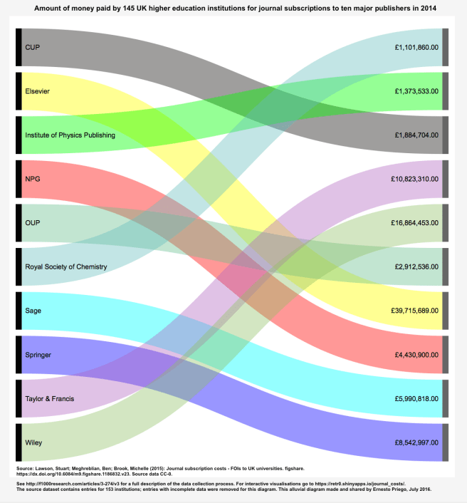
Perhaps the most important scholarly contribution to highlight the level of expenditure in the UK has been by Stuart Lawson et al (2015). “Journal subscription costs – FOIs to UK universities” is an essential reference to both understanding the difficulty of accessing consistent data and to gaining more detailed insights into how much UK universities spend on paywalled/subscription journals.
In my teaching I constantly address issues of quantitative and qualitative methods. It’s possible that my background in critical theory, philosophy and information studies still defines many of my approaches to numerical data and their interpretation. When it comes to visualising data, I assume that the map is not the territory (Korzybski 1931), and that no source data set, and no data visualisation is ever neutral. No matter how ‘clearly’ a visualisation may appear to represent data, different types of processes of interpretation have been required to render data in a particular shape and form. No matter how ‘correctly’ the data has been presented and how ‘appropriately’ the visualisation techniques have been applied, the result is never neutral nor objective. I appreciate this is still controversial, as science and the scientific method appear to still be concerned with revealing truths.
As I like doing research openly on the Web, I may sometimes share some bits of work in progress that perhaps no one else would otherwise see as they are part of the process and not definitive results. I like sharing them to produce reactions and as a means to obtain feedback as I’m still working on something. (Also because I like sharing, period). It’s also a way of documeting publicly some of my own workflow. I like experimenting, for example, with very quick, basic visualisations of data I have curated and cleaned a bit. Often these visualisations do not necessarily employ the ‘best’ or ‘correct’ ways of visualising the source data. Sometimes this is the result of trial and error (I like experimenting and I seek to learn from my mistakes) but sometimes I am aware I am just playing or seeking to use a ‘wrong’ method (on purpose!).
For instance, in this case I wanted to once again draw attention online (i.e. on Twitter) to the issue of the amount of money spent by UK institutions on journal subscriptions according to Lawson et al (2015). It’s been a year since they published the last version of the dataset so I wanted to reuse and link back again to their output. I knew they had already created a very handy interactive visualisation tool so people could explore the data in different ways. I wanted to focus not on which institutions had spent how much, but on the total amount spent on 2014 on each of the ten main publishers. Of course this data could be visualised with a basic bar chart, and this already exists. My intention instead, I hoped, was to attract new attention, on Twitter, to Lawson et al’s data. My intention was to create a colourful image to make people wonder ‘what on earth is this?!‘ and hopefully follow the references (if they made the effort to click on the image, expand it, save it o their desktop to see more clearly).
So.
I appreciate how annoying inadequate visualisation can be. I am aware an alluvial diagram such as the above is not the ‘right’ form to visualise this data. I saw this exercise as a very simple, very quick, consciously tongue-in-cheek strategy to use colour and flows to call attention to the names of the publishers and the flow of cash, in very boring alphabetical order, and if your disposition/sense of humour/tolerance and browser/screen/device allowed it, invite you to follow the paths to amounts spent. I was of course asware this was a labyrinthine way of doing it. I hoped to make those watching to stop for a second and try to figure out stuff. My intention sharing a chart like this is not to say ‘this is the clearest and best way to communicate this data’, but simply to attract some attention once again to the fact these publishers exist and that those amounts appear as spent on them in the source dataset.
I have read and often recommend Edward Tufte’s The Visual Display of Quantiative Information (1983), The Functional Art by Alberto Cairo (2013), Visualise This by Nathan Yau, and of course Tufte’s Beautiful Evidence (2006). Cairo is right when he writes that “graphics, charts and maps are not just tools to be seen, but to be read and scrutinised” (2013:xx), and Tufte’s dictum “graphics reveal data” (1983:13) is the foundation of a widely-accepted code of best practice for visualising data.
Most handbooks and textbooks will insist that choosing the ‘right type’ of chart of visualisation is essential. Strictly speaking as professionals we can all agree this is correct, but we rarely interrogate what else could be done with different types of visualisations, or what the ‘wrong type’ of chart could help people make of the data. In my teaching, I often show ‘wrong types’ of visualisations as a means to explain why different types of data organisation and curation require, enable or reject different types of visualisation.
Moreover, thinking for longer about why a visualisation seems ‘wrong’ can help us think more carefully about our own assumptions and cultural paradigms. Hierarchical data, taxonomies and different methodologies of classification define and impose (and are themselves the result of) discoursive practices that, to my constant amazement, can themselves offer the very keys to their own unlocking and revealing. In other words, ‘wrong’ visualisations can illuminate things both about data and about visualisation techniques– and in a way they always-already do because if we can detect the visualisation is ‘wrong’ it’s because we have in some way paid attention to the data the visualisation is supposed to represent. In my book, ‘wrong’ visualisations are useful because they can make us pay attention and realise that visualisation is not transparent and should not be taken for granted as a method of interpretation. I suppose the best visualisations can almost make us forget they are constructs and that they are not reality itself but mediated representations.
When thinking about monopolies of knowledge, I’d like to argue that we need to focus on the key commercial entities playing a leading role in scholarly publishing. Knowing how much our institutions spend on subscriptions to journals from these publishers is important, but this tells only a part of the story. Perhaps my mindset when creating and sharing a quick exercise in visualisation like the above is that we need to focus on different aspects of the data, and that the data is never ‘raw’, but displayed and organised in different ways according to what we may want to emphasise or achieve. Perhaps it’s just overthinking what to some will be downright bad practice. As online visibility was what I was aiming to obtain I guess one of those objectives has been met (impressions are in the thousands now). I know data visualisation is a serious discipline and there are experts and scholars achieving absolute excellence out there. I am willing to accept the whole little exercise was a total failure. In any case I hope it does not hurt anyone for me to play a little bit with visualisation tools in order to see what happens if we do things in a quick and basic, non-orthodox way, in order to simply call a little bit of more attention to what I consider a pressing issue in scholarly communications.
References
Cairo, Alberto (2013): The Functional Art. An Introduction to Information Graphics and Visualization. New Riders.
Fiormonte, Domenico and Priego, Ernesto (2016): “Knowledge Monopolies and Global Academic Publishing”. The Winnower. https://thewinnower.com/papers/4965-knowledge-monopolies-and-global-academic-publishing
Korzybski, Alfred (1931): “A Non-Aristotelian System and its Necessity for Rigour in Mathematics and Physics”, a paper presented before the American Mathematical Society at the New Orleans, Louisiana, meeting of the American Association for the Advancement of Science, December 28, 1931. Reprinted in Science and Sanity, 1933, p. 747–61.
Lawson, Stuart; Meghreblian, Ben; Brook, Michelle (2015): Journal subscription costs – FOIs to UK universities. figshare. https://dx.doi.org/10.6084/m9.figshare.1186832.v23
Tufte, Edward (1983): The Visual Display of Quantiative Information. Graphics Press.
Tufte, Edward (2006): Beautiful Evidence. Graphics Press.
Yau, Nathan (2011): Visualise This: The FlowingData Guide to Design, Visualization and Statistics. Wiley.

You must be logged in to post a comment.