Yesterday I attended the Digital Transformations Moot organised by the Arts and Humanities Research Council in London. My colleague Sarah Quinnell and I participated in the ‘Yack Space’ with a ten-minute flash presentation on our Networked Researcher project. You can view our slides here.
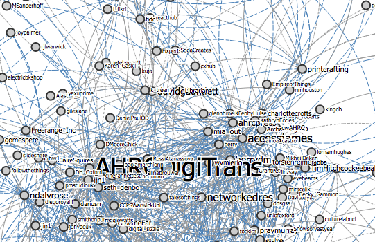
This morning I used Martin Hawksey‘s TAGSExplorer to create a visualisation of a Google spreadsheet archive of the #digitrans tweets. You can view it here.
By tweaking the visualisation’s URL you can also see the nodes connected by @ mentions and @ replies, here.
And if you want to push your browser to the limit and see web entanglement in full effect, the archive can also visualise RTs (here).
Note that the visualisation is in fact an interactive, searchable arhive. You can click on nodes to find out more and also search by keyword.
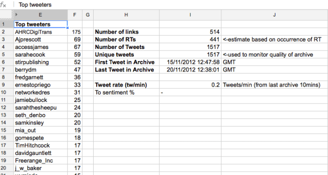
The Google spreadsheet archive was created once the event had finished (this morning around 9:00am GMT) and it updates itself every fifteen minutes. Nevertheless since the RL event officially concluded last night we can argue most of the event’s backchannel tweets have been collected. At the time of writing this post the archive had collected 1517 unique tweets:

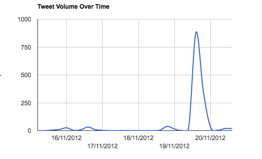
As expected most of the tweets were posted during the day of the event (19 November 2012), with some activity some days before and the day after:

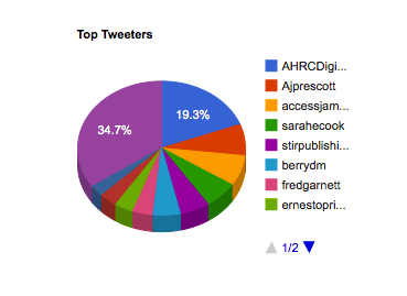
The top tweeters were divided between the organisers, speakers and attendants:

I have found Martin Hawksey’s tool very useful to collect, archive, visualise and analyse Twitter activity, particularly academic conference backchannels. It offers a way of revealing the intrinsically networked and social (as in, involving human interaction) nature of a Twitter’s stream data.
As a form of data mining and distant reading, visualising archives of Twitter backchannels (and therefore networks) can be a useful way of demonstrating an event’s public impact and of discovering key participants, topics, sentiment and links.

You must be logged in to post a comment.